Sweap set up for admins
Account setting
Administrator's guide to setting up your account
General account settings
Enable AI Feature
The event tags - creation and usage
Create guest fields for your account
Adding deletion rules to automatically delete guest data
Set up templates
User roles and permissions
Permission sets - Default user roles in Sweap
Permissions and configuration of default permission sets
User permissions and their functions in Sweap
Setting up new users
Use single sign-on
Roles and permissions
Visibility groups
Event-Ticketing - e-payment with Sweap
API and publishing package function
Implementing the event overview page within your website
Implementing the event overview page in an IHK24 website
Use Sweap's Zapier integration
Import of distributors with EVA
Import groups and committees from EVA master data
Sweap app and devices for check-in
Set up domain and email address
Getting started with Sweap - Basics
Event overview and dashboard
Basic structure of the event overview
The action field and its functions
The calendar view for your events
The event dashboard - overview
Event Sustainability Widget
Basic functions
Event formats in Sweap
What are event series?
Single event creation with Sweap
Create event series in Sweap
Create sessions for your event series
Using time zones in Sweap
Duplicate an event to use it as a template
The preview mode for creating emails or webpages
Using the correct image sizes
Create text with the HTML-Editor
AI feature in use in HTML editor
Use placeholders in Sweap
Customize headlines and text with HTML
Linking emails and websites in Sweap
Legal notice and privacy policy
Support and data protection at Sweap
GDPR-compliant consent management and cookie banners
Tracking-Tools on your Sweap event pages
Data tracking with Sweap
Privacy policy and GDPR
Questions about security & data protection
Sweap AI - Questions about security & data protection
Increasing security - introduction of Keycloak
Session limits - session limitation
Send your feedback about Sweap
The withdrawal button (Section 356a BGB) – implementing it with Sweap
Personal settings
Search and filter functions
The search function in Sweap
Using the filter function in Sweap
Last Update and Last Reply of your guests
Best practice, online webinars and updates
Create and manage contacts and guests
Create, import and export guest information
Add guests to your list
The guest import with Excel
Edit guest information and change status manually
Export your guestlist
Create and manage contacts
Add companions
Manage attributes for guests and divisions
Standard Fields and Event-Related Information in the Guest List
Create and edit attributes
Segmenting guests by categories
Postal mail invitation and QR code
Setting up and sending emails
Setting up and configuring emails
The email types and their use
Create mails more efficient with using the duplicating function
Testing emails in the editor: Here's how it works
Individual salutation
The guest salutation
Create guest salutation with our salutation assistent
Use your own salutation form in your emails
Dynamic email builder
Dynamic email builder: Create emails
Guest-Links and Token: Efficient Event Communication
Configure emails using a dynamic modular system
Design your email - Content
Design your email - Rows
Design your e-mail - General
Email wizard
The different types of email templates
The Email template LA LUNA
Static email wizard: creating emails
Configure emails - set up an invitation email
Call to Action Button withinin emails
Insert links for virtual events into emails
Insert stock photos into emails
Font types in emails
Troubleshooting for emails
Opt-In states and bounces
Reduce spam probability of emails
Display images correctly in my email
Delivery notification and bounces in the email log
Basics for the successful delivery of emails
Tracking email opening rates
Important information about blocked email addresses - status "mailjet: preblocked
Sending out emails
Registration pages & Virtual event platform pages
Registration page basics
Creating a registration page - basic steps
Metadata and SEO for registration pages
Deactivate event pages (URL link tracking)
Registration page - using the Website Builder
Registration page - using the websitze wizard
Templates for your webpage
Contents and modules of a registration page
Texts, colours and design for the registration page
Settings to close the registration page - Website Wizard
Registration options settings within the Website Wizard
CSS & Java Scripts for website customisation
Header and footer within a website
Publish events on your own website
Font types on websites
Setting up the registration form
Configuration of a registration form
Add a checkbox with URL to the registration form
Show and hide form fields
Enter accompanying persons (registration form)
Newsletter Integration
Virtual Event Platform
Integrations and modules for the Virtual Event Platform
Operate and monitor events with Sweap
Label printing
Monitor events
Event status and the stages of your events
Postponing and cancellations of events
The confirmation status from guests
Event Insights - The key figures of your event
Sweap guestlist app and check-in
Sweap Budget
Table of Contents
- All Categories
- Operate and monitor events with Sweap
- Monitor events
- Event Insights - The key figures of your event
Event Insights - The key figures of your event
 Updated
by Julia Walther
Updated
by Julia Walther
The event management team is often confronted with the hurdle that events have to be put into figures in order to be able to evaluate them. To be able to make reports and measure the success of your event, you can call up the event insights of your event.
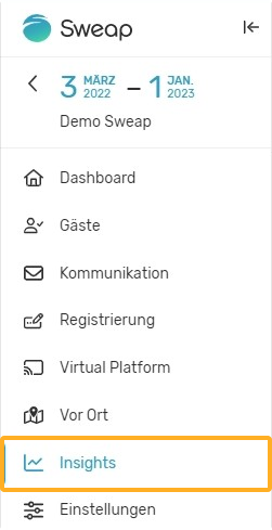
You can find these figures under the menu point "Insights".
Event insights are available for all forms of events you can run with Sweap. So it doesn't matter if you're running an on-site event or if your event is digital or hybrid. You can view the numbers online in Sweap or download them. For downloading you can use our PDF export function.
The information in our Insights is divided into the categories 'Registration', 'Communication' and 'Check-in'.
Registration
Within the registration section you will find 5 graphics, we present you these graphics below.
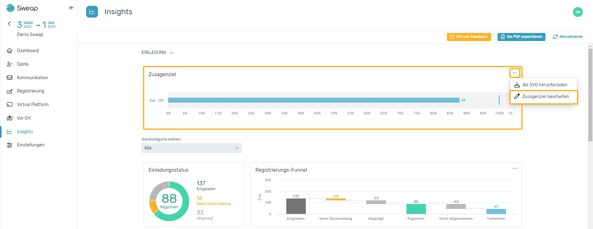
Registration Goal
The first graphic in the registration section shows the 'Registration Goal' and the progress towards it. If you create your event with our event creation process, you can define a target directly when creating your event. If you create your event without our wizard, you can set this target by clicking on the three dots in the upper right corner of the graphic. Define how many registrations you would like to achieve for your event. Our system will then provide you with a corresponding evaluation.
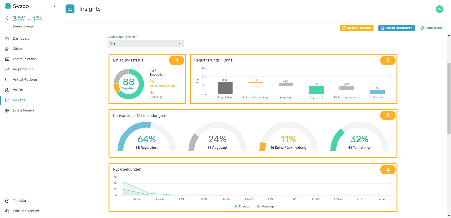
Registration status
(1) The next chart, 'Registration status', is a simple pie chart that divides the invitees by their feedback. You can see at a glance how many of your invited guests have registered, decliend, or not at all given you feedback.
Registration Funnel
(2) The "Registration Funnel" chart is a waterfall chart. This chart goes into more detail by showing the guest state in a funnel. Often it's not enough to just know how many acceptances or rejections you've generated. The registration funnel graph allows you to put your numbers in perspective, as we also show you information about how many participants were generated from acceptances or if you had "no shows". This gives you important insights into where, why and when you lost potential participants.
Conversions
(3) The conversions graph breaks down participants by their conversion status as a percentage.
Replies over time
(4) The last graphic of the Registration section shows you a line diagram. On this graph, you can see when the invited contacts decided to accept or decline the invitation. This last graph is especially useful if you want to measure other event marketing efforts: Do the spikes in accepted invitations correlate with your targeted promotions? If not, why not?
However, the real magic of the first section can be found in the "Choose guest category" dropdown box. This feature allows you to display the graphs just presented in relation to your guest categories. This gives you even more detailed information about how the invited contacts of the respective categories reacted. We want to give you the possibility to analyze more specifically how the invitation to your event was accepted.
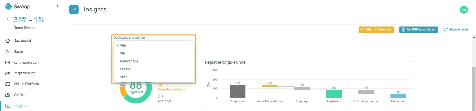
More information in regards to guest categories can be found here.
Communication
The second section within the insights shows you two graphs whose usefulness should not be underestimated. Both graphs, the funnel and the 'Registration Impact' graph, illustrate the effectiveness of your email communications. Using the drop-down menu, you can analyze your communication tools by viewing the graphs individually in relation to your emails. You can thus find out what influence which email had.
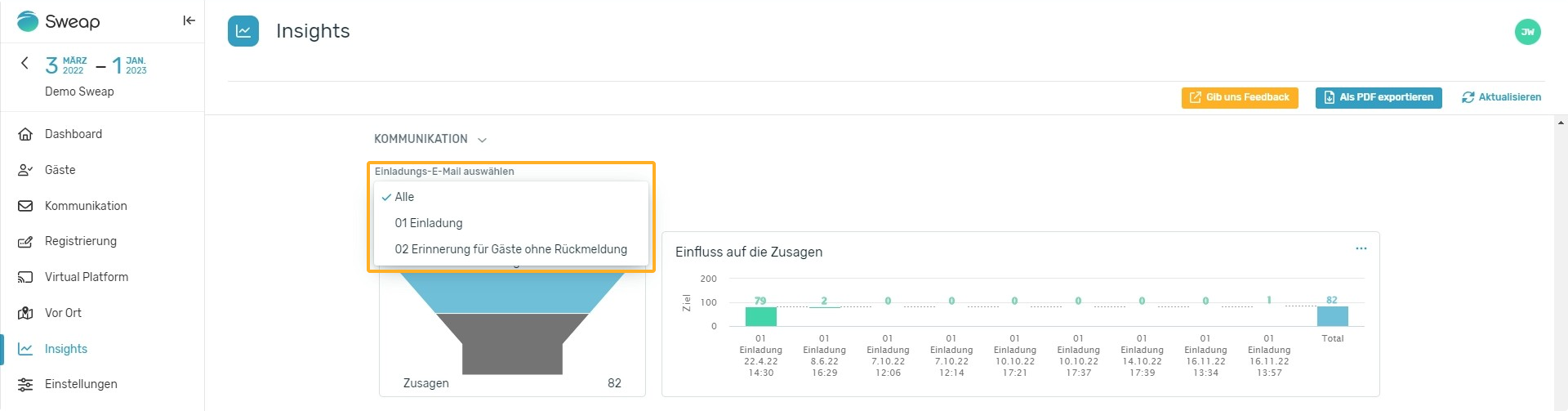
When using our Event creation assistant you can create different emails for your event, from early bird invites to reminder emails to closing calls. By tracking the click through rates of your emails and plotting them on the graph below, you can determine which emails had the most or least impact. This graph will help you make decisions for your next event.
Check-in
The last section displays information about the people checked in. You can find all information about the check-ins within four different graphs.
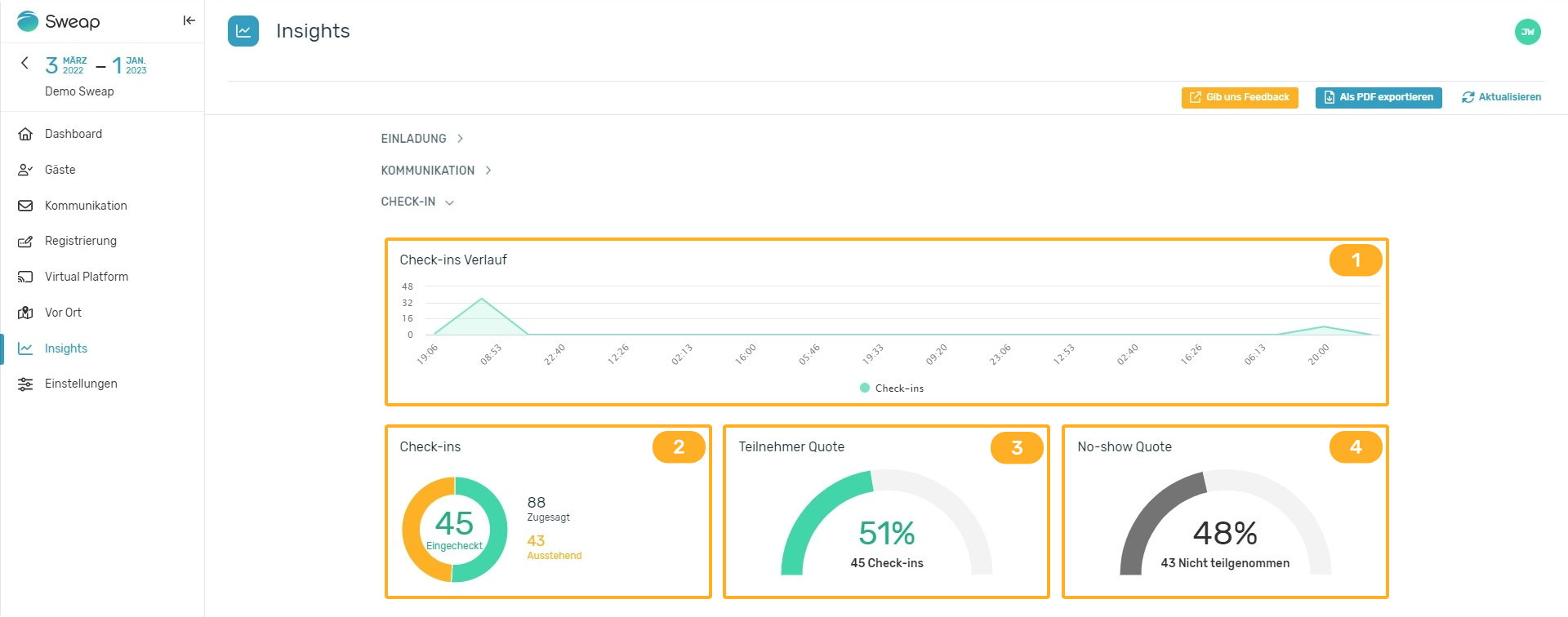
Check-ins over time
(1) In this line diagram you can see exactly when the participants have checked in. From the information of the check-in time good conclusions can be drawn especially for recurring events:
- do the participants arrive on time,
- are your planned admission times sufficient or should they be staggered,
- should you offer longer entry times or are even shorter corridors sufficient.
The last three graphs contain the following information:
Check-ins (pie diagram)
(2) This graph shows you the number of check-ins versus guests not yet checked in, based on the number of commitments.
Attendance Rate (in percent)
(3) This graph shows you, based on the number of acceptances, how many participants took part.
No-show Rate (in percent)
(4) This graph shows you, based on the number of acceptances, how many guests did not attend despite accepting.
All of these numbers are pieces of information that you should have on hand both during and after an event.